Brothers in Arms is a team-based initiative focused on promoting unity, resilience, and support among individuals facing challenges, whether in mental health, military service, or community work. The project required cohesive branding, visual storytelling, and design materials that would resonate emotionally with a wide audience and reinforce the message of brotherhood and strength in unity.
Introduction
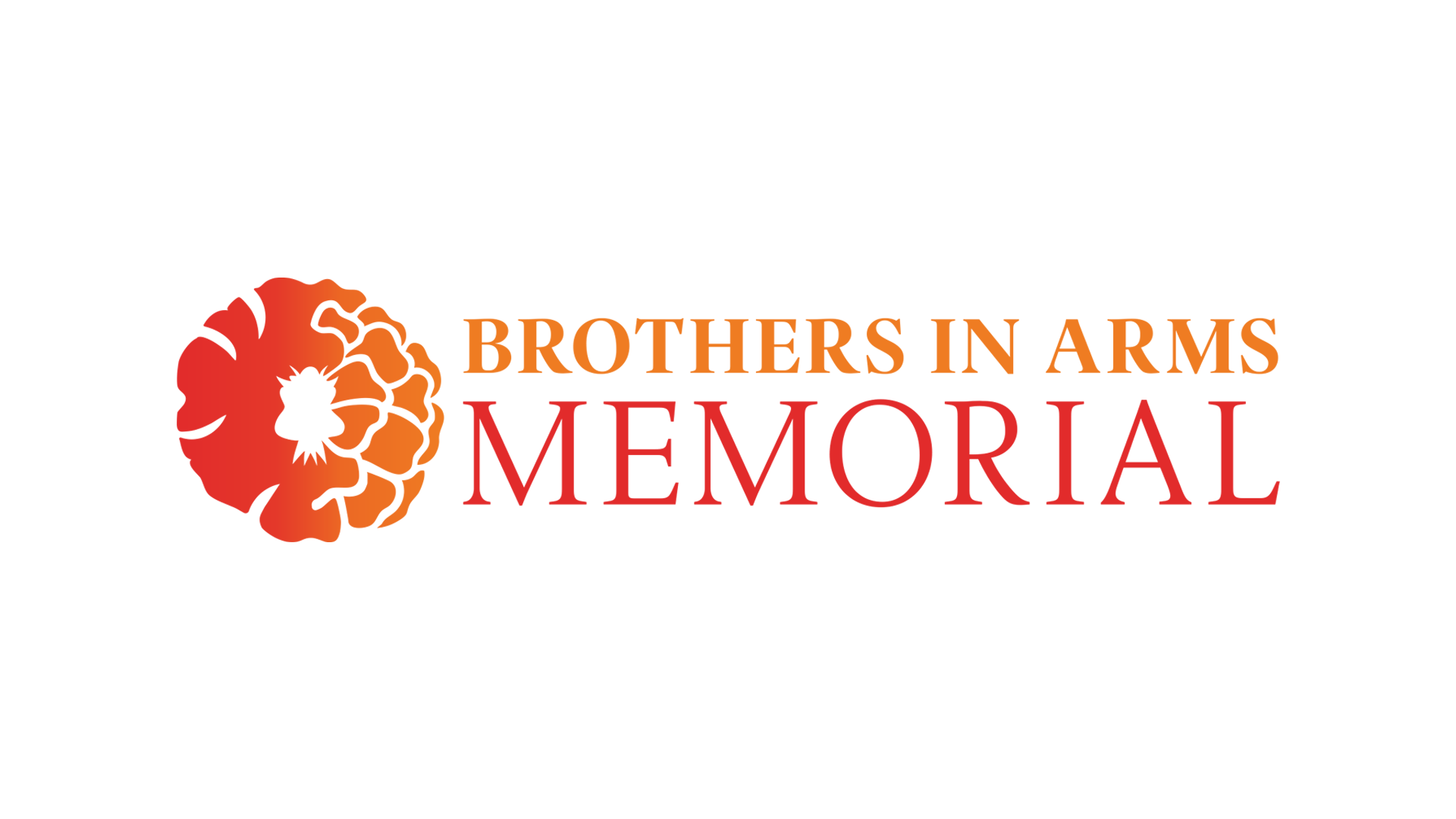
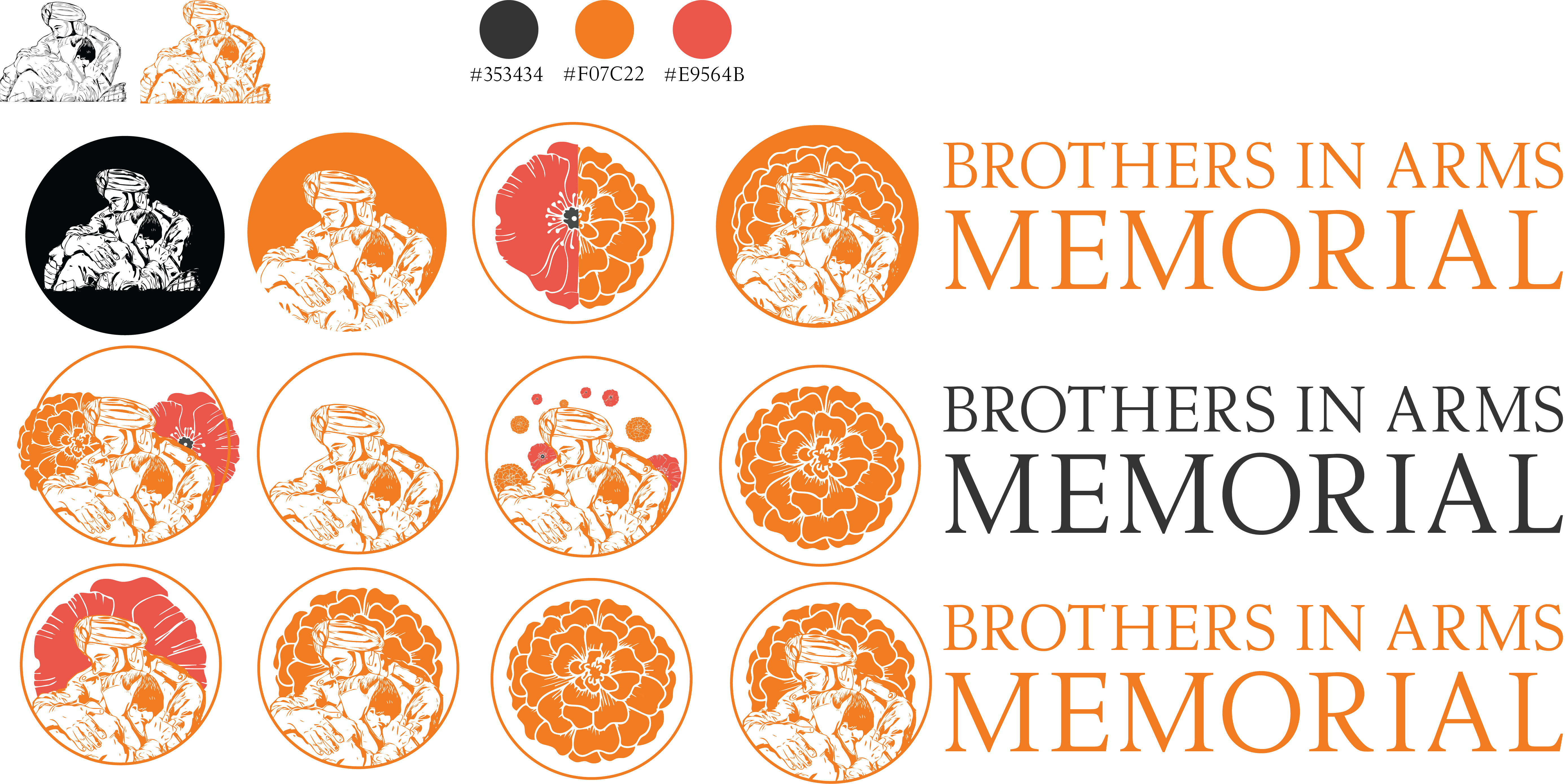
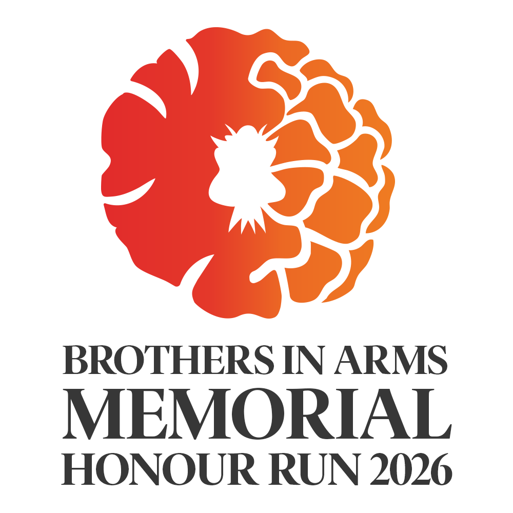
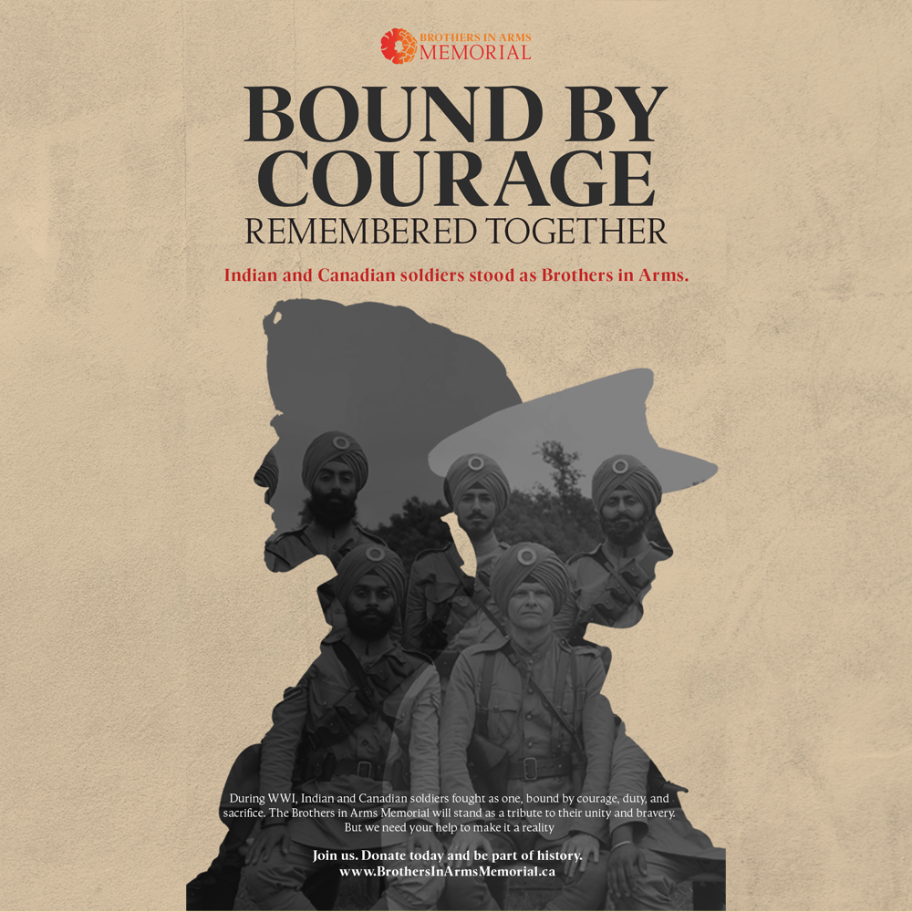
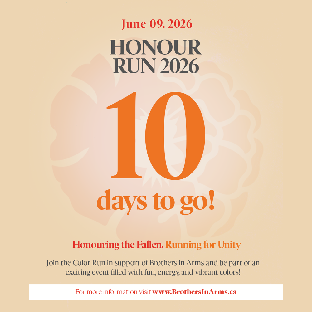
As the graphic designer on the Brothers in Arms project, my task was to visually capture the spirit of camaraderie and strength through every element of the campaign. From logo design and color palettes to posters, social media assets, and merchandise mockups, the visual identity had to reflect both the grit and heart behind the name. My goal was to make sure every piece of visual communication contributed to a powerful and memorable brand presence.
Despite the strong concept behind Brothers in Arms, this new project started without a brand guide or unified visual identity, which made it difficult to convey its emotional weight and values to the audience. There was a clear need for a design direction that could connect with diverse audiences, including veterans, supporters, and community members, while maintaining authenticity and impact.
Challenges
Designing for Brothers in Arms came with a unique set of challenges. One of the biggest hurdles was finding the right tone that was strong yet empathetic, bold yet respectful. The audience was diverse, ranging from military veterans to civilians with no direct connection to the themes, so the visuals needed to be universally relatable. We also faced resource limitations in terms of time, imagery, and tools, which required creative thinking and efficiency. Because of the serious nature of the campaign, it was essential to approach every visual element with emotional sensitivity and awareness.
Solution
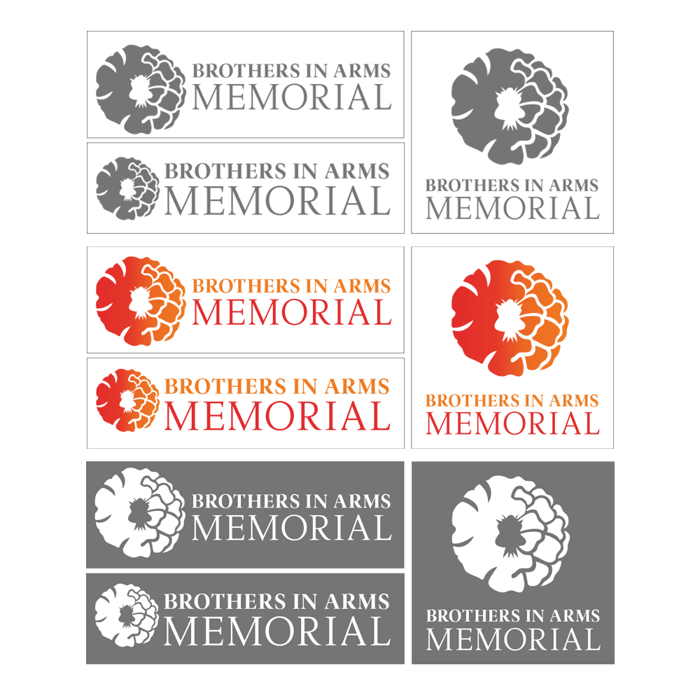
To address these challenges, I focused on building a strong, meaningful visual identity from the ground up. I designed a logo that combined symbolic elements of protection and unity, such as shields and linked arms, to represent the theme of brotherhood. I created a grounded color palette with deep blues, muted earth tones, and bold accents to convey stability, courage, and emotional depth.
All assets were designed with flexibility in mind so they could be reused across different formats. I also incorporated real quotes and personal stories into the visuals to humanize the campaign and create a stronger emotional connection with the audience. Accessibility and clarity were prioritized in every layout, ensuring that the message reached as many people as possible.
All assets were designed with flexibility in mind so they could be reused across different formats. I also incorporated real quotes and personal stories into the visuals to humanize the campaign and create a stronger emotional connection with the audience. Accessibility and clarity were prioritized in every layout, ensuring that the message reached as many people as possible.
Ready to Collaborate?
I’m always excited to collaborate on new projects or just chat about creative ideas.
Drop me a message, and let’s make something awesome together!